Thursday 10 November 2016

Creative Industries - Where Does My Work Sit?

Reflecting on my practice at the moment, I'd say it relates most to: 

Editorial & Reportage
Within my work I find I'm really inspired when I'm responding to something real, I feel there's more pressure to do the topic/subject justice, which makes me work harder. For example, in OUIL504, I researched Haruki Murakami and read that he liked strong and bold design, which made me want to bring that aspect into my editorial illustrations about the motifs within his work. Since they were about Murakami, I wanted them to be something he'd like and that represented traits of his personality.  I enjoy making observations and incorporating them into my work, it makes sense to me to make work about something real. This is also because I want the audience to be able to relate to what I'm saying through my work. 

However I'd like to look more into:

Publishing & Book Design 

Product & Packaging 

Object & Environment

Throughout the course I've really admired work from Penguin and Saul Bass, so I really like the thought of making really graphic and striking book covers. Over the summer I also made my own Etsy shop so want to be able to branch out on what i'm able to sell on that. I'd really love to be able to design my own products and packaging for them and be able to have some sort of an income (however small it may be) from it. I have a really keen interest in architecture and because a lot of my work, aesthetically, tends to be quite precise and thought out it'd be good for me to try and apply this to my interests (in architecture).

Friday 4 November 2016

Louise Lockhart


Today Louise Lockhart came into the studio to give us a lecture about her practice as an illustrator. It was really interesting hearing about her work process and how she approaches a project or brief. She made it sound really simple! Hearing about 'The Printed Peanut' and how she started her shop was so inspiring, the way she spoke about it was really candid and made me feel like it was something I'd be able to do (maybe in the future though). It was also good to see how she'd applied illustration to a range of different sources and products... some of which I'd not even thought about before.   


She showed us some examples of her work and I found I really appreciated the simplicity of it. A lot of her images and products do look quite complex, but it was nice to find out that with most pieces of work, she starts by using paper cut. It seems like a really simple but quite a logical way to work out compositions and finding out how the final image will work as a whole. 


Friday 21 October 2016

The Creative Industries

What is an industry sector?

  • Goods-producing segment of an economy
  • An area of the economy in which businesses share the same or a related product or service
  • An industry or market sharing common characteristics
  • Standard economic modules identify 4 industrial sectors
* Primary Sector - The primary sector of the economy extracts or harvests products from the earth. 

* Secondary Sector - The secondary sector of the economy manufactures finished goods.

* Tertiary Sector - The tertiary sector the economy is the service industry.

* Quaternary Sector - The quaternary sector of the economy consists of intellectual activities.

3 Main types of companies working in the creative industries:
  • Design studios/consultancies/agencies
  • In-house creative teams
  • Freelance practitioners
"Charity" - If they're not paying me, why not? Are they paying for other things?

"Good exposure" X

"Future work" - "We'll give you future work if you're willing to work for free"

Low pay - Overheads - Hours

Friday 30 September 2016

Etsy


After the Lungs Project exhibition, it gave me the push to set up an Etsy shop. First it was difficult having the courage to make it live, I kept it unopened for a while, and didn't even promote it straight away. 

Having opened it though, I've realised I can see what products on my shop people view the most and what they're most interested it. Which gives me a better insight and understanding of the market.


Friday 16 September 2016

Lungs Project

"Lungs Project is Angela Wingate Burdon, Marta Rubinato, Rebecca Burdon and Sheyda Porter. Currently based in Newcastle upon Tyne and Sunderland, the Lungs team uses collaboration and exchange to support emerging and underexposed artists and art scenes.
In September, LUNGS 2016 launched as an annual print magazine cataloguing the work of artists in the North East of England. Open to a range of creatives and mediums, Lungs aims to facilitate artistic development and provide both a national and international platform to exhibit."


The launch of 'Lungs' was celebrated with an event at Independent, Sunderland. Which included an exhibition featuring 15 of the 30 artists whose work appeared in the publication. 


I was lucky enough to be one of the fifteen chosen artists to exhibit work at the launch event. I included three pieces from my Level 4 body of work. Each were an abstract interpretation of windows in three different cities. When producing these images, I was very conscious of the colour pallet, making sure they'd all look like part of a set. This paid off when it came to hanging them in the exhibition, as well as looking cohesive, it gave a clear indication of which work was mine. 


This was such a valuable experience! Seeing my work not only exhibited, but also included in a publication along side 29 other artists from the North East, blew me away a little bit. It gave me a great sense of achievement and built my confidence dramatically. Making me realise I can put my work out into the world, and someone will enjoy it. Being at the exhibition also made me realise I could sell some of my work, I had few enquires about my prints on the night of the event, this made me think about setting up an online shop.


Monday 16 May 2016

End of Module Evaluation


Leeds College of Art
BA (Hons) ILLUSTRATION
Level
04
OUIL402 Personal & Professional Practice 1
Credits
20
End of Module Self Evaluation


NAME
Ella Ray Barnes


1.  What learning have you inherited through this module and how has it impacted on your own understanding of professional practice? Consider yourself as a student at University as much as an illustrator
I think it has helped me to understand the professional side of illustration, and allowed me to see how I’d fit into this industry after my degree. It doesn’t feel a foreign as it did before I started the course. This module has also helped me to be more organised, and manage my time and work load a lot better.
 
2. What approaches/ types of research have you found most valuable over this module?
Why did they have such an impact?
I think I’ve found books and exhibition visits the most useful. Going out and finding something in a book or seeing a new exhibition has been so much more rewarding I think, because it makes me feel like I’m actually doing something productive with my time without ‘working’ as such. I also think going to exhibitions I didn’t know anything about was really good, sometimes they were awful to be fair but other times I was really pleasantly surprised and even came across something new that I liked.
 
3. In what way has PPP informed the way you work in other modules and your illustration practice as a whole?
During my other modules I think because of PPP I’m more aware of how I’d make a career from the work I make, rather than just making it to just get a grade.  
 
 
4. What weaknesses can you identify in your PPP submission and how will you address this in the future?
Although I’ve looked at a vast amount of practitioners, I think I could’ve utilised my Pinterest account more than I did, I think this would’ve helped me to see more of what is current. I think I could’ve engaged with other artists a little more, even if this was just in class. But I think this would really benefit me, and get me and get me out of my comfort zone more by talking to people I wouldn’t necessarily talk to.
 
5. What communities of practice and professional contexts do you intend to investigate further as you approach level 5? Why do they appeal to you?
·         I’ve recently had some of my work chosen to be shown in a publication about rising creatives in the north east, so I’d really like to branch out like this a lot more.
·         I’d like to be more involved with the SOLO Arts group in Sunderland a lot more, and help curate exhibitions, as well as meeting like-minded individuals.
·         I want to continue going to as many exhibitions as I can, even if I don’t know much about them, because this will give me the opportunity to engage with other artists.
·         I want to continue to use the studio a lot more in my free time, just because I find working in a creative environment very rewarding and enjoyable.
·         I’d like to try and set up an Etsy shop over the summer, and put my work out there a little more, rather being so hesitant about it.


6.How would you grade yourself on the following areas:
(please indicate using an ‘x’) 
 
5= excellent, 4 = very good, 3 = good, 2 = average, 1 = poor
 
1
2
3
4
5
Attendance


/
 
Punctuality


/
 
Motivation


/
 
Commitment


/
 
Quantity of work produced
 
 
/
 
 
Quality of work produced
 
 
/
 
 
Contribution to the group
 
 
/
 
 
The evaluation of your work is an important part of the assessment criteria and represents a percentage of the overall grade. It is essential that you give yourself enough time to complete your written evaluation fully and with appropriate depth and level of self-reflection. If you have any questions relating to the self-evaluation process speak to a member of staff as soon as possible.


A copy of your end of module self evaluation should be posted to your studio practice blog. This should be the last post before the submission of work and will provide the starting point for the assessment process. Post a copy of your evaluation to your PPP blog as evidence of your own on going evaluation.


Notes

Sunday 15 May 2016

Studio Brief 3: Creative Strategy 1

http://issuu.com/ellabarnes9/docs/ppp_presentation.pptx

Studio Brief 2: The Illustrated Self

Written Diagram...


Roughs...
Development...
 
  • Tried out different media
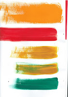
  • Really like the aesthetic of cute paper, particularly the torn edges.
  • Different colour pallet options
  • I want to go for a Wes Anderson-esque colour pallet, to represent the films I enjoy and which influence me creatively.

  • Gouache wasn't quite as nice as the paper.
 
Final Outcome...
 
 
So I went for quite an abstract approach to the 'Illustrated Self' brief. I wanted to included all of the things that represent me, and even more so, the things that influence me as a practitioner.
So I've include my flute and a movie camera projection. Coffee beans, because I spend a big portion of my time in coffee shops and have met like minded people through doing this at home. Autumn leaves, because autumn is my favourite season, but also because my whole wardrobe is full of autumn colours! The pink circle and black rings, represent the logo of group in Sunderland that organise 'SOLO' exhibitions each month, which I've volunteered for in the past, and attend the exhibitions regularly. The brown, pink and green rings with black lines represent my record collection, and show the importance of music to me. An 'M' to represent my cat (who I adore, tabby cats have distinct markings (an M on the forehead, and a swirl on their side), so that's what that is all about. And finally the blue rectangles represent all the lovely books I buy but probably don't really need.
 
What am I happy with...?
  • I like the colour pallet I chose, I think I've also managed to balance the colours quite well which I found difficult at first.
  • I think I've represented myself well in the image, I think people that know me would be able to understand it straight away.
 
What did I find difficult...?
  • I found it difficult trying to analyse myself and make whatever that was, visual.
  • It was quite difficult to simplify some of the things I wanted to have included in the piece, I was quite conscience about trying not to make it look too overcrowded.
 
What would I do differently?
  • Although I was trying to channel my love for Wes Anderson films through the colour pallet, I think it could have worked with maybe less colours.
  • I could maybe have played around with the composition a little more before settling on my final one.   

Seo Kim 'Cat Person'

 
OH MY GOD. THIS BOOK. TOTAL FAVE.

'Cat Person'...proper hilarious. It's ridiculous how much I relate to parts of it.
 The illustrations in it are adorable, so child like and so honest!


Edward Gorey "The Gashlycrumb Tinies"

 
Super good, but super dark!


The illustrations in this book really suit the theme, pretty dark but also really well thought out and intricate. I loved that it rhymed throughout. Seems like quite a simple idea, but just so brilliantly executed. Well nice. 


The WES ANDERSON Collection

 
THIS BOOK IS SO COOOOOL
 
Loved reading bits of this. Some of my favourite films were directed by Wes Anderson so it was really interesting to hear how they were made and what went on during the making of.
I found it really helpful when it comes to choosing the composition of my own images, and it made me a lot more aware of the colour pallets I chose.


Phillipa Rice 'Soppy'

 
Super lovely, and really honest book. The colours are AMAZING, I actually wondered how she manages to balance the images throughout the whole book so well, since she only uses two colours and a stock, she makes it look so effortless.


Maurice Sendak 'Where the Wild Things Are"

 
I can't believe how old this book is! The illustrations are beautiful, and clearly timeless. I also really enjoyed the story, like a total child.
 

Craig Thompson 'Blankets'

I read Blankets by Craig Thompson, and totally loved it. I couldn't put it down.
 
This moment in the book stuck with me the most, it was just so poignant. Especially the last frame where you just see a tiny part of where the mural once was. Amazing.


Monday 4 April 2016

Yum Yum Land @ SOLO Arts (Sunderland)


Hmm, this exhibition was a bit weird... it wasn't one of my faves but I think I liked it. It was interesting that she used garish colours in juxtaposition to beauty. Rebecca Reed's work reminded me a lot of Laura Callaghan. The way she used bright, flat colours and because Reed's exhibition was focused around a strong female figure.

 
These little sculptures I liked a lot though! They really made me want to touch them. I love the colours the artist has selected in her work, even though they don't necessarily compliment each other, they do make you wonder what her intention was.
 

Monday 7 March 2016

A3 Posters - Personality/Professionalism/Aspirations

Here are the roughs I made for this task... I wanted to try and keep my ideas simple, but without having just a plain list.

I liked the idea of trying to have repetition in my images as well, to try and add some structure to them.


Final Posters...
 
I made my final posters using gouache and acrylic, I just thought that it helped me to achieve a nicer quality to them... rather than using the markers I used whilst making the roughs.


What am I happy with...?
  • I'm happy with the basic colour pallet I chose, I think the variation of orange works well as it's just a subtle change.
  • I'm pleased that I've managed to keep the repetition going throughout the three posters, I think it makes them work well as a set, and I think they look quite uniform.
  • I think my idea is quite strong, I wanted them to almost look like patterns, and I think the way I've done them lends itself well to this idea. At first I think it's maybe a little unclear as to what they're about, but are easy to understand once realised they're just in grids.
 
What did I find difficult...?
  • I found actually coming up with an idea for them was difficult.
  • I didn't really know what I should include on the personality and aspirations posters. I found it difficult to analyse myself for it the personality one. And then decided to go with graduating for my aspirations, because really that is my short term aspiration at the moment.
 
What would I do differently...?
  • If I'd been able to, I'd probably have used a different two colours on each poster just so they looked a bit more different to each other.
  • I think a dark blue/navy stock colour might've looked quite nice against the oranges.