Written Diagram...
Roughs...

Development...
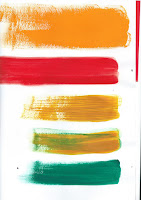
- Tried out different media
- Really like the aesthetic of cute paper, particularly the torn edges.
- Different colour pallet options
- I want to go for a Wes Anderson-esque colour pallet, to represent the films I enjoy and which influence me creatively.
- Gouache wasn't quite as nice as the paper.
Final Outcome...
So I went for quite an abstract approach to the 'Illustrated Self' brief. I wanted to included all of the things that represent me, and even more so, the things that influence me as a practitioner.
So I've include my flute and a movie camera projection. Coffee beans, because I spend a big portion of my time in coffee shops and have met like minded people through doing this at home. Autumn leaves, because autumn is my favourite season, but also because my whole wardrobe is full of autumn colours! The pink circle and black rings, represent the logo of group in Sunderland that organise 'SOLO' exhibitions each month, which I've volunteered for in the past, and attend the exhibitions regularly. The brown, pink and green rings with black lines represent my record collection, and show the importance of music to me. An 'M' to represent my cat (who I adore, tabby cats have distinct markings (an M on the forehead, and a swirl on their side), so that's what that is all about. And finally the blue rectangles represent all the lovely books I buy but probably don't really need.
What am I happy with...?
- I like the colour pallet I chose, I think I've also managed to balance the colours quite well which I found difficult at first.
- I think I've represented myself well in the image, I think people that know me would be able to understand it straight away.
What did I find difficult...?
- I found it difficult trying to analyse myself and make whatever that was, visual.
- It was quite difficult to simplify some of the things I wanted to have included in the piece, I was quite conscience about trying not to make it look too overcrowded.
What would I do differently?
- Although I was trying to channel my love for Wes Anderson films through the colour pallet, I think it could have worked with maybe less colours.
- I could maybe have played around with the composition a little more before settling on my final one.


No comments:
Post a Comment